or
Let sleep dog lie
This has been published in German first, deepl.com helped with translation. Some links lead to German Websites most of the studies are in English.
Those who believe in conspiracy theories at the headline should first take a look at the studies that have examined the effectiveness of the vaccinations. In four studies, which confirm that the vaccines are effective two weeks after the second vaccination, there is the side finding that the probability of contracting Covid19 is significantly increased between the first and second vaccination.
Study 1: „Early effectiveness of COVID-19 vaccination with BNT162b2 mRNA vaccine and ChAdOx1 adenovirus vector vaccine on symptomatic disease, hospitalisations and mortality in older adults in England“

Fig.1: Increased Odds ratio“ on left side Source A: „Early effectiveness of COVID-19 vaccination with BNT162b2 mRNA vaccine and ChAdOx1 adenovirus vector vaccine on symptomatic disease, hospitalisations and mortality in older adults in England“ Authors: Jamie Lopez Bernal, Nick Andrews, Charlotte Gower, Julia Stowe, Chris Robertson, Elise Tessie, Ruth Simmons, Simon Cottrell, Richard Roberts, Mark O’Doherty, Kevin Brown, Claire Cameron, Diane Stockton, Jim Mc Menamin, Mary Ramsay Licence (CC BY-NC-ND 4.0)
On the last page. For copyright reasons I can’t show the chart here.
Zitat: „Our results show that there is an increased … incidence of VOCB.1.1.7 in partially vaccinated individuals.“
Another study and two other references to increased likelihood of infection between vaccinations are in the dropbox.
If these studies are correct, the number of new daily infections and also the number of daily Covid19 deaths should correlate with the number of daily vaccinations.

Fif. 2: Correlation in Bahrain*, Kuweit, Oman und Kambodscha; Jeweils Screenshot von ourworldindata.org übereinandergelegt, mit Markierungen von mir; im weiteren Quelle B genannt: Max Roser, Hannah Ritchie, Esteban Ortiz-Ospina and Joe Hasell (2020) – „Coronavirus Pandemic (COVID-19)“. Published online at OurWorldInData.org. Retrieved , Licence (CC BY 4.0);
* In ourworldindata.org the Data Daten of Bahrain was delted. More Details in my Dropbox
The curves correlate strikingly well. In the Arab Gulf States, which all have similar climatic conditions, the increases always follow immediately after the start of the national vaccination program. This can be seen in the chart of Bahrain by also seeing the data on Oman and Saudi Arabia. There, there was no vaccination at that time and no increase in new infections and Covid19 deaths. However, as soon as Oman also starts vaccinating, the numbers of Covid19 deaths will increase there as well. In Cambodia, there was virtually no Covid19 before vaccination began.
The number of „new cases“ in the United Arab Emirates, which vaccinated particularly quickly and heavily, is shown in Figure 3.

Fig 3: VAR**, Data of ourworldindata.org, and own calculation in Spreadsheet
**More details to this chart in my Dropbox
If you look at the curves over longer periods of time, the correlation of vaccinations and deaths stops fairly early, usually when vaccination programs switch to younger ones. The correlation with the number of new infections stops a little later. Why is unknown to me. Either the effect is not as strong in younger people or they get it much less often, so they are less likely to be tested.
This raises the question, why is the probability of infection increased both in the studies and in various countries between the two vaccinations?
There is an article in the renowned bmj.com that attributes this to the fact that people mistakenly believe they already have protection after the first vaccination and therefore show riskier behavior that leads to an increased probability of infection.
This sounds logical at first, but when you look at the studies above, questions arise. One of the studies was conducted on medical personnel. How likely is it that medical personnel really believe they are already protected after the first vaccination?
In another cohort, the studies looked at nursing home residents with the same results. How can people who are barely able to leave the home on their own exhibit significantly higher risk behaviors?
Nor can it have been due to the comliance of the vaccinated to the measures. In this study, no significant difference was found between the vaccinated and the unvaccinated.
Also in need of explanation is the time course of the increased likelihood of infection.
Hervé Seligmann and Haim Yativ examined data from a very large study in Israel in which vaccination success was confirmed in about half a million Israelis. After the first vaccination, however, the probability of infection increases significantly just one day after vaccination.
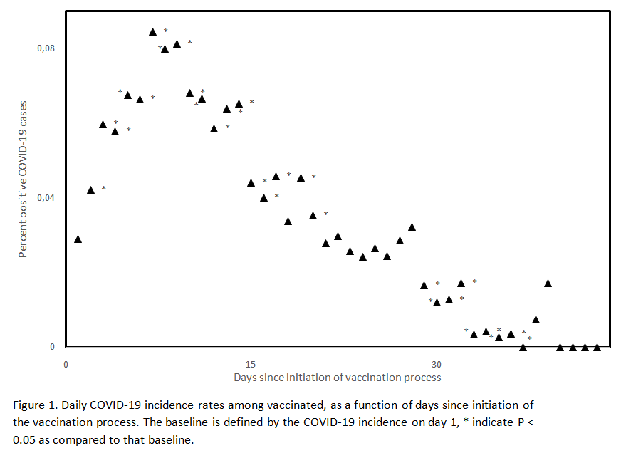
Fig 4: Daily Covid19-19 incidences among vaccinated; Source
They atet: „Unvaccinated and vaccinated groups differ on 1st vaccination day“
They guess that the composition of the control group was not clean. I do not share this assumption. It seems to me rather to reveal a deeper problem of the vaccines, because a recently published study from the UK comes to almost the same conclusion.
Zitat: „Most vaccinated hospitalised patients were infected shortly before or around the time of vaccination,..“
The study shows in Figure 1 a curve of weekly hospitalizations of unvaccinated and vaccinated. Over the turquoise curve of the vaccinated, I have superimposed the curve of daily vaccinations from ourworldindata.org, red dotted line (Figure 5).

Fig 5: Turquoise curve of weekly Covid19 hospitalization of vaccinated and red dotted line is daily number of vaccinations. Two screenshots superimposed from Source B and Source C : Conor Egan, Stephen Knight, Kenneth Baillie, Ewen Harrison, Annemarie Docherty, Calum Semple; Open Government Licence v3.0
One can see until about mid-March the turquoise curve of weekly new admissions correlates very well with the curve of daily vaccinations. From mid-March on, two effects occur. There is an increase in second vaccinations, but in the studies the increased probability of infection was only observed before the second vaccination. In addition, there is an increase in younger people being vaccinated, who are less likely to become severely ill with Covid 19 and therefore less likely to need hospitalization.
To evaluate the curve, I drew 4 vertical blue lines and used the length ratios to estimate the percentage of hospitalizations that were vaccinated. The percentage determined can be seen from the respective blue line (Fig. 6).

Fig 6: Red Curve weekly Covid19 Admissions of unvaccinated, rest like Fig.5; Quelle B und Quelle C, Markierungen und Text im Bild als Hervorhebung von mir
Next, in ourworldindata.org, I found the number of daily immunizations at the position of the blue line (column 2). It is given as a percentage of the total population. In addition, I determined at ourwordlindata.org how many people had already received a vaccination (column 4).

Table1: Comparison of proportion of vaccinated in hospital with proportion of vaccinated in remaining unvaccinated in population
Example on the basis of the last line:
Value in the first column from the graph. The value from the second and fourth column is from ourworldindata.org. The column „weekly vacc“ is calculated from the second column 0.8×7=5.6. The last column indicates what percentage of the unvaccinated are vaccinated during the week. 5,6/(100-39,5)*100 = 9,3%
At the first blue reading line, the vaccinated are underrepresented. In this week, the vaccinated represent 4.2% of the unvaccinated population, but represent only 3.5% of Covid 19 patient hospitalizations. In the following period, the reverse is true. At the last reading line, the vaccinated account for 9.3% of the unvaccinated population but represent 30% of Covid19 hospitalizations. What does this mean? The number of infected vaccinated has nothing to do with the normal incidence of infection, which correlates well with the red area in Fig. If the newly vaccinated were really infected by careless behavior of already infected persons, the curve of vaccinated persons in hospital should also correlate with the curve of new infections. The figure 6 shows that the number of infected persons decreased by 80% during the vaccination campaign. A newly vaccinated person at a later time, (marked by the last blue line) has to meet 5 times more people to meet an infected person he could get infected than at an earlier time (first blue line). Since at the last blue line the vaccinated are overrepresented by a factor of three (30% to 9.3%) even 15 times more. How probable is this?
I would like to remind you that most infections must have occurred on the day of the vaccination or shortly thereafter, i.e. when many people have to deal with side effects such as fatigue (34% to 59%), headaches (25% to 52%), diarrhea (8% to 12%) or were immediately unable to work with sick leave at AstraZeneca.
Tired, with headaches and diarrhea to the Corona party? How likely is that?
The third wave

Bild 7: Germany’s secret about the 3rd wave? Study of Ingo Keck (@ingo_keck), green daily vaccinations (shifted 17 days into the future), blue daily new cases; Quelle; Licenz: Creative Commons Attribution 4.0 International
The study finds a correlation factor of 0,068. That corresponds to 6.8%. Based on the curve, I cannot estimate how many of these are „natural“ infections and how many are triggered by the vaccinations. Mathematically, if a curve is causally (linearly) dependent on 2 factors and already one of them correlates so excellently with the curve, as in Fig. 10, there are only 3 possibilities for the other factor.
- It correlates just as well
- It is constant, then it is not noticeable.
- It fluctuates strongly, but then the influence must be very small, otherwise the curve of the other factor would not correlate so well without the second.
Was the so-called 3rd wave in Germany triggered exclusively by the vaccinations and not at all by B117? If the correlation between vaccinations and the incidence of infection is not considered causal, the question can be answered in the negative. If, on the other hand, there is a causal relationship and B117 has nevertheless driven the incidence of infection through increased infectivity, then of the 3 possibilities mentioned above, only the first option remains, that vaccination rates and B117 correlate to the same extent with the incidence of infection. Likelihood?
In many European countries, the situation is similar. Further pictures with courses to vaccination rate and daily new infections in Europe are in the Dropbox (France, Belgium and Austria), there it is similar.
In some Eastern European countries like the Czech Republic the infection rate was still very high at the beginning of vaccination, there you can’t see any correlation.
Can I convince doubters by showing two countries that have a common border, and similar climatic factors? Both start their vaccination program almost synchronously, subsequently the daily new infections increase in both. Then one country almost completely stops vaccination with the result that the new infections decrease again, but in the other country they continue to rise. There is no such thing?

Fig. 8: India and Bangladesh, Source B ; Licence (CC BY 4.0);

Fig. 9: Daily Vacciantions in Bagladesh, Quelle B markings from me; Licence (CC BY 4.0)
In Bangladesh, the first vaccinations have almost completely stopped in mid-April. The last vaccinations are about 94% second vaccinations. From the studies we know that the effect is mostly between the jabs. More info in the Dropbox.
Further inconsistencies with the start of the vaccination campaign
With the onset of the vaccination campaign, the temporal difference in the course of the pandemic between the northern and southern hemispheres also disappears.

Fig 10: Daily new Infection in Mongolia and Argentina, approx. Vaccination start at reading line, Quelle B; Licence (CC BY 4.0)
In large territorial countries such as India or Canada, where the incidence of infection was highly variable across regions, the regions suddenly show synchronous courses with the onset of vaccination.

Bild 11:Search image Canada, when did vaccination start? Source Clare Craig auf Twitter
More examples in my Dropbox.
What also makes the theory in bmj.com unlikely is the Google Mobility Index, which usually goes down in countries with rising infection rates (e.g., India, Cambodia), so it tends to show reduced social contacts, and the Government Stringency Index goes up. The latter assesses the stringency of the measures. As a rule, countries with growing numbers of infections tighten measures (e.g., India, Cambodia). But the vaccination rate continues to correlate with the number of new infections per day, completely unnoticed by this? Two links to investigate for yourself:
Goggle Mobilty Index and Government Stringency Index
Alternative theory to common explanation in bmj.com
I doubt the theory mentioned in the bmj very strongly. To me, the curves of the increased risk of infection in the studies seem more like a Gaussian distribution with which probability an event occurs, after a cut-off date with a certain probability (cf. Fig. 1 u.4). The close temporal interval of infection to the time of vaccination from the last two studies supports this thesis.
I suspect an effect like with herpes. According to this theory, the SarsCov2 viruses would already be in the body without causing a disease symptom and without detectability in PCR. Vaccination weakens the immune system and thus Covid19 can break out. See Clare Craig’s comment in the commentary to the bmj article, which states exactly the weakening of the immune system after vaccination.
This theory is purely speculative, but it could explain other mysteries. With LongCovid, Covid19 would never really be gone and the seasonal behavior of Covid19 would come about because in winter many people have a weaker immune system due to cold weather, co-infections e.g. rhinoviruses or vitamin D deficiency. It can also explain why track and trace no longer works. In Germany, the infected contact person is only found in 9% of cases. (Source RKI, Tweet of Olaf Gersemann of the „world“). There were also just at the beginning of the vaccination campaign more frequent cases in which Covid19 had broken out massively in nursing homes after the first vaccination, but one could not determine how the virus entered the home, because they were already well protected at that time.
As a place where the viruses can hide in the body from the immune system, fatty tissue may be a possibility or in bacteria in the human intestine. For example, a study just showed that SarsCov2 viruses in a stool sample with intestinal bacteria multiplied like bacteria. Which suggests that they infected the bacteria.
However, this is purely speculative and is only meant to show that it seems possible in principle.
The true cause of the correlation between vaccination rate and new infections is certainly debatable, but it cannot be denied that with the onset of vaccination, infection rates and death rates with Covid19 skyrocket almost everywhere in the world. Instead of letting sleeping dogs lie, these vaccinations fuel infection.

Fig12: Daily new infections in Cambodia; Source B: Licence (CC BY 4.0)

Fig 13: Daily new infections, death and vaccinations in Sechellen; Source B
In Cambodia and the Seychelles, there were practically no cases before vaccination began. Of course, one might argue that the reporting systems there are worse than in our country, but why do they suddenly start working with the start of vaccination? There are examples in many other countries. They are visible when either very fast, very much vaccinated or when before the number of daily new infections was very low. In many cases, it is superimposed on the normal infection incidence and is therefore poorly visible or not visible at all. Figure 14 lists twelve other countries in which the number of new infections rose extremely sharply after the start of vaccination. It should be noted that this article is NOT intended to imply that vaccination is the sole cause of the increase in the number of infections in all cases, but the approximately 24 examples listed in the article make a coincidental correlation seem very unlikely (In my Dropbox is another example).

Fig 14: Reading line marks start of vaccination in each case; from left to right and top to bottom Hungary, Chile, Canada, Philippines, Japan, Monaco, CapVerde, Ireland, Spain, Portugal, Venezuela, Bosnia Herzegovina Quelle B Licence (CC BY 4.0)
Edit: 12.05.21 Added to Dropbox Charts of SaudiArabia, CostaRica, Maledives, Bulgaria, Nepal and Laos.
Edit: 13.05.21 Added to Dropbox Charts of Paraguay and Brazil.
Edit: 19.05.21Added to Dropbox Charts of Malta, Vietnam, Thailand, Bhutan and Taiwan.
This also leads to Covid19 deaths in each country. Added to this increase in cases between first and second vaccination are the other vaccine complications.
The US VAERSystem collects reports of vaccine complications. However, they are not checked, so statements about individual reported cases should be taken with a grain of salt. However, if the cases are evaluated and the reported deaths from Covid19 vaccinations are compared with the reported deaths from other vaccinations and age decades are considered, the following picture emerges.

Table 2: Data from VAERS sorted by vaccination and age group
So far in 2021, there are 2.3 times (0.7% vs. 0.3%) more deaths among those 40 to 49 years of age for Covid19 vaccinations than for other vaccinations in 2021, 3.3 times (2.7% vs. 0.8%) among those 50 to 59 years of age, 4.3 times (8.7% vs. 2.0%) among those 60 to 69 years of age, and 3.6 times (15.8% vs. 4.4%) more deaths among those 70 to 79 years of age. These differences are statistically significant. Among those over 80, the differences are not statistically significant; the number of non-Covid19 vaccinations in this age group is too small. For those under 40, the age range is too large to make a meaningful comparison.
In the study mentioned at the beginning of this article on Covid19 vaccinated patients in hospitals in the UK, there is also an evaluation of the mortality rate. This is consistently increased in the Covid19 patients who come to the hospital despite vaccination. Even when the vaccination program switched to the significantly younger ones (Tier 8 to 10).

Table 3: see page 8 in „Hospitalised vaccinated patients during the second wave, update April ‘21“ Marking in yellow from me Source: Authors: Conor Egan, Stephen Knight, Kenneth Baillie, Ewen Harrison, Annemarie Docherty, Calum Semple; Lizenz Open Government Licence v3.0
However, it is possible that among the vaccinated the proportion of patients at risk is higher than in the group of unvaccinated.
There is another study that indicates that during the vaccination campaign, the number of severe cases in hospitals increased. See Dropbox.
There is a report from Israel that a particularly striking number of younger people (measured against previous years) die during the vaccination period. Please read carefully! There are not more younger people dying than older people, it is the other way around. However, the change from the previous years is supposedly particularly striking among the younger ones.
According to the established media the data source is not very reliable, but a comparison of administered vaccination rates in ourworldindata.org shows that the vaccination program had reached younger Israelis in calendar week 11. Euromomo shows a striking peak in calendar week 11 among those 15 to 44 in Israel (Figure 15)! It is the highest peak in this age group since 2015! That’s as far back as Euromomo’s data goes!

Fig15: Excess death in Israel in Age Group 15-44, red Line is set by me; Source: Euromomo
Euromomo shows another correlation between the vaccination program in Israel and excess mortality in different age groups. The vaccination program in Israel started with the oldest and gradually progressed to the younger. In Euromomo, one can see that the peak of excess mortality in the age groups behaves synchronously. In the younger age groups that are vaccinated later, the peak in excess mortality also comes later.
Specifically, in the 85+ age group it is in calendar week (CW)2, in the 75 to 84 age group it is in CW3, in the 65 to 74 it is in CW3, in the 45 to 64 group it is in CW4, and in the 15 to 44 group it is in CW11.

Fig 16: Peaks in excess mortality from older to younger sorted from top to bottom. Red line as highlighting by me: Source: Euromomo
Conclusion:
In almost all countries the days with the highest Covid19 death rates and excess mortality fall in the vaccination campaign, extreme examples are USA, UK and Israel, in very many countries there are extreme correlations between vaccination rates and death from Covid19!
Besides the „side effect“ death, in the American VAERSytem there is an accumulation of reports with thrombosis, embolism, blindness, tinitus which are all related or can be related to the clotting of blood.
There is a study that found that spike protein alone without complete virus has the ability to clott cells. The vaccinations stimulate exactly the production of this spike protein.
Younger people in particular, however, have a good chance of not even getting the virus into the bloodstream in the case of a natural infection with SarsCov2, since it is already successfully fought in the nasal mucosa and thus the problematic spike protein does not even get into the bloodstream. Especially asymptomatically infected people, i.e. usually younger people, often only have antibodies in the nasal mucosa.
With a vaccination, however, the spike protein always enters the bloodstream directly. The better immune system then leads to a more violent immune response in younger people, which also produces more severe side effects.
Harm and benefit are extremely poorly distributed here. It is also rather unlikely to get infected once a year, but one is supposed to be vaccinated every half year now. Each time with the risk of side effects. It is not impossible that the side effects will become more severe from vaccination to vaccination. Already now the side effects are more violent with the second vaccination, especially with younger people.
To use these vaccinations, which have been approved in a hasty procedure, on a massive scale, now even in children, is ethically unjustifiable in my eyes. In children there is almost no benefit, but they get the whole risk package imposed. The EMA has already received reports of vaccine damage in children who have been vaccinated against Covid19, although widespread use has not yet begun.
With other vaccinations, vaccine complications were found in the past, sometimes only after 1.5 or more years.
These Vaccines require more time to investigate. The frequent argument that without vaccines there would be no herd immunity is false. Especially for respiratory diseases, natural immunity always developed in the past. There was never a vaccine for the Spanish flu! It was no longer noticeable after three waves. It has still not disappeared! Its genetic information is still found in the influenza viruses. We just don’t die from it as often anymore because we have built up immunity. The fact that now the risk groups have a certain protection by the vaccination is wonderful, for them the benefit and risk should be in a good relation, for the broad mass of the population there are in my opinion too many unanswered questions.
The argument without vaccination we cannot „open“ is also wrong. Countries like Sweden and South Dakota, have not had a single day, business, restaurant or bar closures. In Sweden, schools were almost universally up, without masks. In South-Dakota, schools had already reopened last fall with classes in attendance, churches open as well.
Death rates per capita in Sweden are now much lower than the European average, and in South-Dakota they were actually lower at peak than in North-Dakota, which, unlike South Dakota, had adopted mandatory masks and business closures. Florida had already opened everything last September, BEFORE vaccination began in the U.S., but protected at-risk groups. The number of elderly and especially vulnerable groups, such as obese, blacks and Hispanics is much higher there than here in Germany. California has similar climatic conditions to Florida. California with lockdown etc. has much worse infection numbers since Florida opened in September.
The point of vaccinating younger people is beyond me.